Motor Racing is expensive; hideously expensive; so expensive beyond club level motor racing, virtually every car which is put onto a race track becomes a mobile billboard. The thing about having a mobile billboard doing 200mph is that in order to communicate the message of the brand who happens to be paying the bills, it all has to be done fairly efficiently.
In a far off smoky past, the most memorable liveries put on race cars, were provided by the tobacco companies who had their logos and colours writ large across these modern day chariots; with all the subtlety of an egg being struck with a sledgehammer (see Horse 1349).
The thing is though, it isn't just the various tunes of whoever happens to be paying the piper which is memorable. Sometimes, the drivers themselves become like a sort of brand; with their own personal number being on display.
This year, Formula One got around to assigning personal numbers to drivers which they will have for their entire career. MotoGP has been doing this for a while now, with Valentino Rossi's 46, Marc Márquez' 93 or Barry Sheene's famous 7. In Australian Touring Car racing, Dick Johnson ran 17 for many years and Peter Brock continued to use 05 long after the Victorian Department of Transport stopped their association.
The way I see it, it makes perfect sense that a number is part of a driver's personal brand; which is as marketable as anything else. Since motor racing is (and let's be brutally honest about this) more or less gloriously pointless, it then becomes a matter of telling a story; stories are memorable if we see the same characters over and over again.
To that end, I don't understand why a billboard which is moving at 200mph needs to relegate what could be a marketable thing, to the status of a small yellow blob in a side window. Whilst money talks, does it really need to yell so loudly that you can't even tell the difference between two identical cars?
NASCAR in the United States learnt this trick years ago - make the numbers on the doors and the roof sufficiently large enough so that you can actually identify who is who. When two dozen fast moving objects go past, all roughly the same size and you can tell which ones are which, then surely that seals the argument doesn't it?
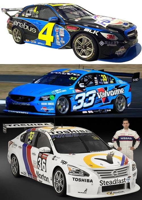
This is why I now present the following exhibit:
In all three cases it's obvious from far away what the numbers are. If your intent is to communicate a message as quickly as possible, then why not do that. While we're at it, why not make the liveries nice and simple as well. The reason that people remember good logos and designs is because they often only have a few design elements. The fact that the Nissan, which is the bottom of the three, is able to ape something which still lives in the memory 30 years later is because the original colour scheme was nice and simple. If people can at best remember only about ten things at once, why force them to do so?
Do something simple and concise once and people will remember it forever. That works equally as well for logos, corporate brands and even something as obvious as putting big numbers on the doors.


No comments:
Post a Comment