This is the kit that the Socceroos will be wearing in South Africa. Now admittedly it's not the worst kit that Australia has ever played in, but to be honest, it's not that great either.
The bottom line is that it looks aesthetically wrong.
To be fair, green and yellow (or rather gold) aren't exactly the easiest colours to work with. It must be said though that the Wallabies, the Kangaroos and heck even the Australian Cricket team have all done pretty well with those colours and produced decent kits.
The Wallabies made their mistake several years ago with a flashy strip, and the Kangaroos have basically played in the same green kit with yellow Vs on it since 1910.
The question then is, how hard is it to come up with something?
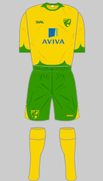
The bottom line basically when designing a football kit, is that simple is best. I had a look through a brilliant database (?) of English football kits, and found that the team which most resembles Australia is Norwich City:
http://www.historicalkits.co.uk/Norwich_City/Norwich_City.htm
Personally I like a halved or quartered look:

Though even something more recent with just a yellow kit with green collars and flashes is also quite reasonable:

See? If I'd been in charge, we'd have had something nice and respectable. Not the weird wierd weerd wiird kit that we have now.
Oh, groovy, funky Channel 27. Big smegging deal.

No comments:
Post a Comment