
In Hello Internet Episode 18¹ there was a passage of discussion about the United States' state flags² and how they collectively are a giant wibbly-wobbly graphical mess. A group called the North American Vexillological Association, in 2001 ranked all the US and Canadian state and provincial flags³ and the best of them showed strong graphic design standards, whilst the worst were all of the "seal on a bed sheet" design.
I had a thought about the Australian state flags and realised that if Australia does at some point become a republic, then the idea of having a defaced blue ensign with the state badge on, would become intolerable (or maybe not, there is the curious case of Hawaii which has the Union Flag in the canton despite never being a British colony or possession) and so, they would all need to change.
Fortunately though, there are already two perfectly acceptable flags in Australia which could serve as a model for new flags to replace all the state flags on that terrible day of Australia's becoming a republic. I used the ACT's flag as the template because the southern cross in the Northern Territory's flag is actually graphically different for reasons that I do not know.
The basic idea that I took, was to take the badges from the existing state flags which I do not think need to change at all and place them into the right hand field. The southern cross would remain on the left hand side and the colour schemes all came from the colours that we already associate with the states. Obviously since I'm only using Paint that came with Windows, they're not going to be brilliant and I suppose that I could have centred the badges or resized them and fiddled with Pantone colours but the point was to show the concept; which I think is obvious.
I also think that it is pretty obvious which state is which too.
These then are the 8 "state" flags, in order that they came to be:

New South Wales - 1788

Tasmania - 1825

Western Australia - 1829

South Australia - 1836

Victoria - 1851

Queensland - 1859

Northern Territory - 1911

Australian Capital Territory - 1911
The colours were chosen on the basis of the state's primary colour, except for Western Australia because the black swan badge on a yellow field just looked silly. Tasmania got red stars on that same basis because they looked better, as did the blue stars for South Australia (and in keeping with their third colour, although it does kind of inadvertently look like I'm biased towards the Adelaide Crows).
Other than that, I think that they all look fine; maybe a little dull but importantly, obvious.
Addenda:
The national flag should be equally as obvious. I had a bit of a muck about for three minutes and came up with this:
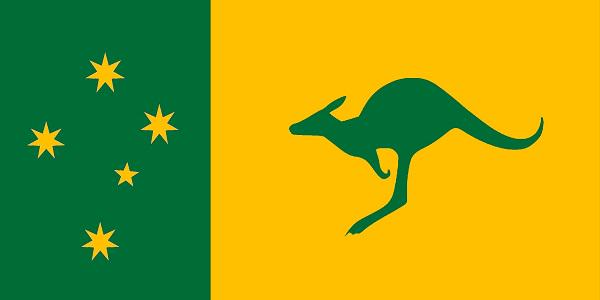
Surely that's as obvious as the nose on your face.
Links:
2 comments:
If people didn't know any better, they might confuse these with the real state flags. They look like they should already be the proper flags.
Conceptually they would all be better IMHO with white southern cross on the blue background to the left as in the NSW example, then they would have unity and integrity in design. The big fail though is Victoria with 2 southern crosses. That could be addressed though by an inspired redesign of their State emblem. Good work though at bringing together flags which were designed not to bring the country together but to build an independent idenity in each colony. I am impressed at your skill with Paint!
Post a Comment